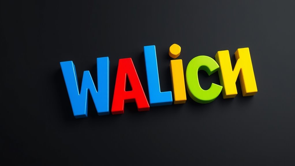

To make multi-colored words truly pop, use bold contrast between the text and background, such as black on white or bright hues. Combine this with a clear font hierarchy—large, vibrant headers draw attention, while subdued colors guide the eye to supporting details. Strategic use of size, weight, and color helps organize content and makes key words stand out. Keep experimenting with these principles, and you’ll discover more ways to enhance your typography’s visual impact.
Key Takeaways
- Use vibrant, contrasting colors for multi-colored words to make them stand out and attract attention.
- Apply clear font hierarchy with size and weight differences to enhance the visual impact of colorful typography.
- Ensure high contrast between text and background for maximum readability and emphasis.
- Combine color variation with strategic font styles to guide the viewer’s focus effectively.
- Maintain overall balance by using bold colors sparingly to prevent visual clutter and ensure words pop.

Have you ever wondered what makes some text instantly grab your attention? It’s often the way the colors and fonts work together to create a visual impact. When you’re designing or reading, the key elements that make words pop are color contrast and font hierarchy. These tools help guide your eye and emphasize the most important parts of the message, making your content more engaging and easier to understand.
Color contrast is vital because it determines how well your text stands out against its background. If the colors are too similar, your words can become hard to read or get lost in the visual noise. On the other hand, high contrast—like black text on a white background or bright yellow on dark blue—immediately draws your attention. When you use contrasting colors thoughtfully, you can highlight specific words or sections, making them feel more dynamic and lively. This technique isn’t just about being colorful; it’s about creating a visual hierarchy that directs your focus where you want it to go. For example, using a bold, vibrant hue for headlines and a softer tone for body text establishes a clear visual flow that guides your reading experience.
Font hierarchy plays an equally important role. It’s about organizing your typography so that your audience knows what to read first and what to prioritize. By varying font sizes, weights, and styles, you create a visual roadmap that naturally leads the eye through the content. When you establish a strong hierarchy, the main message stands out immediately, while supporting details are still accessible without overwhelming or confusing the viewer. Combining font hierarchy with color contrast amplifies this effect—bright, bold headers catch your eye first, then the contrasting, slightly subdued body text keeps your attention without overwhelming it. This layered approach makes your message clearer and more memorable.
In essence, when you’re designing with multi-colored words, you’re not just adding vibrancy; you’re strategically guiding your audience’s attention. Proper use of color contrast ensures readability and emphasis, while thoughtful font hierarchy organizes information intuitively. Together, these elements make your typography not just visually appealing but also highly effective. So, next time you craft a message or choose a font style, remember how powerful these tools are. When used well, they turn plain text into a mesmerizing visual experience that commands attention and communicates your message with clarity and flair. Incorporating visual hierarchy principles enhances the overall impact and effectiveness of your design.
Frequently Asked Questions
How Do Multi-Colored Fonts Affect Readability?
Multi-colored fonts can enhance visual harmony and create a strong emotional impact, but they might also hinder readability if overused. When you choose vibrant colors carefully, they draw attention and evoke specific feelings, making your message more memorable. However, if colors clash or are too flashy, they can distract or confuse your audience. Balance is key—use multi-colored fonts strategically to boost engagement without compromising clarity.
What Color Combinations Are Most Effective in Typography?
Like a painter mixing colors on a palette, you should choose combinations that create strong visual contrast and harmony. Brights paired with dark shades, such as blue and yellow or black and red, are most effective. These combinations make your text stand out and are easy to read. Focus on balancing color harmony with vibrant contrast to guarantee your typography is eye-catching yet clear to your audience.
Can Multi-Colored Typography Be Used for Branding?
Yes, you can definitely use multi-colored typography for branding. It taps into color psychology, making your brand more memorable and engaging. Bright, bold colors can evoke emotions and convey your brand’s personality, boosting recognition. Just make certain the color choices complement each other and reflect your brand values. When done right, multi-colored typography creates a vibrant, eye-catching look that stands out and leaves a lasting impression.
Are There Accessibility Concerns With Colorful Text?
They say, “Beauty is in the eye of the beholder,” but when it comes to colorful text, accessibility matters too. You need to take into account color contrast to guarantee readability for all users. Too many vibrant colors can disrupt visual harmony and make it hard for some to see clearly. To avoid accessibility concerns, balance colorful typography with high contrast and simple design, making your message inclusive and eye-catching.
Which Software Tools Are Best for Creating Multi-Colored Words?
You should try tools like Adobe Illustrator or Canva to create multi-colored words. These programs let you choose a vibrant color palette and easily customize each word or letter. Focus on selecting a cohesive font pairing to guarantee your typography pops without sacrificing readability. With these tools, you can experiment with different color combinations and styles, making your design eye-catching and professional.
Conclusion
Now that you’ve explored the vibrant world of multi-colored typography, let your words dance off the page like a burst of fireworks. Embrace the bold hues and playful contrasts, turning plain text into a lively melody that catches the eye and stirs the imagination. Remember, your typography is the heartbeat of your message—let it pulse with color and energy, making every word pop like a star shining brightly in the night sky.