
The colors you choose for a graphic tee can instantly set the mood and influence how others see you. Bright reds and oranges project confidence, energy, or passion, while calming blues and pastels create a relaxed, approachable vibe. Neutral tones help you blend into subdued settings, while bold hues make a statement. Your color choices communicate feelings and personality without words, shaping first impressions. Keep exploring, and you’ll uncover even more ways color can craft the perfect look.
Key Takeaways
- Bright, vibrant colors evoke excitement, energy, and confidence, making the graphic tee appear bold and attention-grabbing.
- Cool tones like blue or green create a calm, relaxed, and approachable mood in the design.
- Warm hues such as red or orange signal passion and urgency, influencing viewers to perceive the shirt as dynamic.
- Muted or monochrome palettes lend a sophisticated, understated vibe, altering the mood to more subtle or serious.
- Color combinations and contrasts can enhance or soften emotional responses, shaping the overall message of the graphic tee.
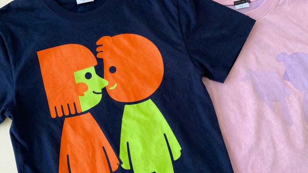
Choosing the right colors for a graphic tee can profoundly influence the mood it conveys, making your clothing not just a fashion statement but also a reflection of your personality or feelings. When you pick colors intentionally, you’re tapping into color psychology, which studies how different hues evoke specific emotional responses. For instance, red often signals energy, passion, or urgency, while blue can create a sense of calm and stability. Understanding these associations helps you craft a message with your shirt, whether you want to appear confident, relaxed, or approachable.
Design aesthetics also play an essential role in how color impacts your graphic tee. The way colors are combined, contrasted, or muted influences the overall visual appeal. Bright, vibrant shades tend to grab attention and evoke excitement, making your tee stand out in a crowd. Conversely, softer or monochrome palettes can lend a more understated, sophisticated look, emphasizing elegance or subtlety. When you consider design aesthetics alongside color psychology, you can fine-tune your shirt’s mood to match your intent—be it playful, serious, rebellious, or artistic.
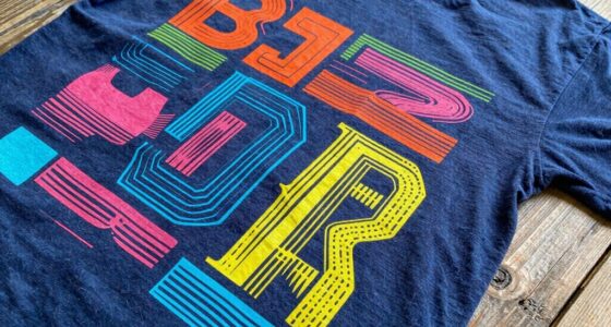
Bright colors attract attention and evoke excitement, while muted palettes create a subtle, elegant look.
You might notice that certain color choices align with your personal identity or how you want to be perceived. If you’re feeling bold or want to project confidence, choosing bold reds, oranges, or yellows can boost your energy and attract positive attention. On the other hand, if you’re aiming for a more relaxed vibe, shades like pastel greens, blues, or muted earth tones can communicate tranquility and approachability. The colors you select can even influence how others perceive you, shaping first impressions without a word spoken.
In addition, the context and environment where you’ll wear your graphic tee matter. If you’re heading to a casual hangout, lively and bright colors might be perfect for creating a fun, energetic aura. For more subdued settings, cooler or neutral tones can help you blend in while still expressing your style. This interplay between color choice and environment underscores how your shirt’s mood can adapt to different situations, enhancing your overall presence.
Ultimately, your color choices serve as a powerful tool to communicate mood and personality. By understanding color psychology and design aesthetics, you gain control over how your graphic tee influences perceptions and feelings. Knowing how color associations impact emotional responses helps you choose hues that align with your desired message. Whether you want to radiate confidence, serenity, or creativity, selecting the right hues ensures your clothing not only looks great but also speaks volumes about who you are.
colorful graphic tees for men
As an affiliate, we earn on qualifying purchases.
As an affiliate, we earn on qualifying purchases.
Frequently Asked Questions
How Do Cultural Differences Influence Color Perception on Graphic Tees?
You should consider cultural symbolism and regional color meanings when designing graphic tees, as they heavily influence perception across cultures. For example, red might symbolize luck in China but danger elsewhere. By understanding these differences, you guarantee your design resonates positively. Ignoring cultural nuances can lead to misunderstandings or offense. So, research regional meanings and symbolism to choose colors that communicate your intended message globally and respect cultural sensitivities.
Can Color Trends Impact the Longevity of a Graphic Tee’s Appeal?
Color trends can make or break a graphic tee’s longevity, as vibrant hues often fade with time, yet timeless shades like black or white endure. You might love a bold, trendy color today, but it could lose appeal fast. Using color psychology, you realize that classic, versatile shades foster trend durability, ensuring your tee remains stylish for years. Embracing these enduring colors helps your graphic tee stay relevant beyond fleeting trends.
How Does Lighting Affect the Perceived Mood of a Colored Graphic Tee?
Lighting considerably influences how you perceive the mood of a colored graphic tee. When lighting intensity is bright, it highlights vibrant colors, creating an energetic and lively feel. In contrast, softer or dimmer lighting can add shadows, making the mood more subdued or mysterious. Shadow effects can emphasize certain design elements or evoke different emotions, ultimately shaping how you interpret the overall vibe of the shirt.
Are There Any Colors That Universally Evoke Positive Emotions on Tees?
You’re holding a magic wand that instantly sparks joy—bright yellows, cheerful reds, and calming blues are proven to evoke positive emotions universally. Color psychology shows these hues foster happiness and energy. When designing your graphic tee, aim for design harmony with these colors to amplify their positive effects. Bright, warm tones tend to uplift spirits, making your tee not just stylish but a beacon of positivity for everyone who wears or sees it.
How Do Personal Color Preferences Influence the Mood Conveyed by a Graphic Tee?
Your personal taste profoundly influences the mood your graphic tee conveys. When you choose colors aligned with your preferences, it enhances authentic mood expression. If you favor vibrant hues, your tee may exude energy and enthusiasm; if you prefer muted tones, it might project calmness or sophistication. Your unique color choices reflect your personality, making the mood of your graphic tee more genuine and resonant with how you want to be perceived.
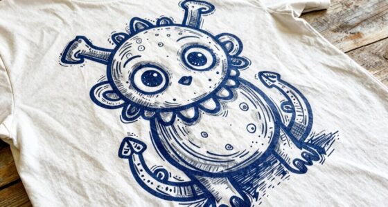
calm blue graphic t-shirts
As an affiliate, we earn on qualifying purchases.
As an affiliate, we earn on qualifying purchases.
Conclusion
Choosing the right color for your graphic tee isn’t just about style—it’s about setting a mood and making a statement. Bright, bold hues can energize your look, while muted tones create a laid-back vibe. So, next time you pick a tee, ask yourself: what feeling do I want to evoke? Can you picture the impact a simple color change can have on how people perceive your message? Your choice can truly transform your entire look.
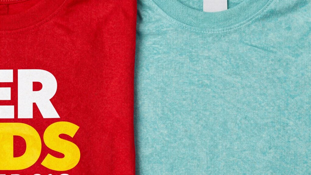
bold red graphic tees
As an affiliate, we earn on qualifying purchases.
As an affiliate, we earn on qualifying purchases.
neutral tone graphic t-shirts
As an affiliate, we earn on qualifying purchases.
As an affiliate, we earn on qualifying purchases.