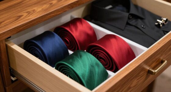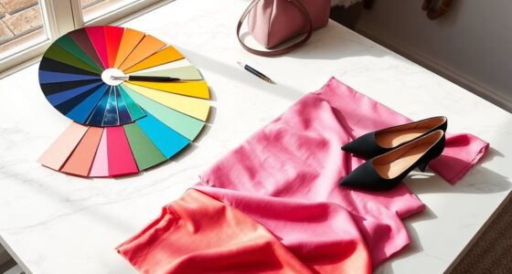
To instantly add depth, try layering transparent sheets with varied textures and contrasting colors. Use bold, darker hues over softer pastels, and incorporate textures like smooth versus rough surfaces to create visual interest. Overlap these layers and adjust their opacity to reveal underlying details, enhancing the sense of dimension. Incorporate lighting effects like shadows and highlights to mimic natural depth. Keep experimenting with these simple techniques, and you’ll discover even more ways to make your designs stand out.
Key Takeaways
- Use contrasting colors between layers to create immediate visual separation and depth.
- Incorporate overlapping elements with varying opacity to add complexity.
- Mix textures—smooth and rough surfaces—to enhance dimensionality.
- Place brighter, saturated colors in the foreground and softer tones in the background.
- Add subtle lighting effects like shadows and highlights to emphasize layers.
Adding depth to your artwork or design can considerably enhance its visual impact, and one effective technique to achieve this is layering. When you layer elements thoughtfully, you create a sense of dimension that draws viewers in and keeps their eyes moving across your piece. The key is to understand how to use color contrast and texture mixing to make each layer stand out while harmonizing with the whole. You don’t need complicated tools or techniques—sometimes, the simplest approach makes the biggest difference.
Start by selecting your base layer, which sets the foundation for your design. This could be a solid background color or a broad, textured surface. Once you have that in place, add a second layer that contrasts in color to your base. For example, if your background is a soft pastel, introduce a bold, darker color on top. This contrast instantly creates a visual separation, giving your artwork a sense of depth. You can also experiment with texture mixing—combine smooth, flat areas with rough, tactile surfaces. This variation in texture helps different parts of your composition pop at different levels, making the overall piece feel more dynamic. Notably, understanding the importance of contrast ratio in visual design can help you achieve a more striking effect.
When layering, think about how each element interacts with the others. Use color contrast not just for vibrancy but to guide the viewer’s eye. Place brighter, more saturated colors in the foreground and softer, muted tones in the background. This visual hierarchy mimics natural depth perception, where objects closer to us tend to be more vivid. Texture mixing further enhances this by giving certain layers a tactile quality, making them seem closer or further away depending on their surface qualities. For instance, a glossy, smooth object can appear to leap forward compared to a matte, rough surface that recedes into the background. Incorporating perceived depth through thoughtful layering can make your artwork more engaging and immersive. Additionally, understanding how visual cues influence depth perception can help you create more convincing illusions of space.
To maximize the effect, consider overlapping your layers rather than stacking them strictly side by side. Overlapping creates intersections that add complexity and interest, emphasizing the layered structure. Don’t be afraid to vary the opacity of your layers as well. Transparent or semi-transparent layers can reveal underlying textures and colors, adding subtle depth that might not be immediately obvious. Incorporating lighting effects can also enhance the perception of depth by creating shadows and highlights that mimic natural conditions. This technique encourages viewers to explore your work more carefully, discovering new details with each look. Additionally, calibrating your color accuracy ensures that the hues you select will translate well on different screens or mediums, maintaining the intended depth and vibrancy.
In essence, the secret to adding instant depth lies in strategic layering. By combining color contrast with texture mixing, you can transform a flat design into a lively, engaging piece. Keep experimenting with different combinations until you find the perfect balance for your style. With this simple trick, your artwork will immediately gain a richer, more immersive quality that captures attention and invites closer inspection.

Hygloss 8.5" x 11" Acetate Paper – 7 Mil Clear Acetate Sheets for Crafts Projects, Classroom Stencil Sheets, Overhead Transparency Sheets for Projector, Clear Plastic Sheet (Not for Printers) 10 Pack
8.5" x 11" FOR OVERHEAD PROJECTORS & CLASSROOMS – Let your presentation stand out in every meeting with…
As an affiliate, we earn on qualifying purchases.
As an affiliate, we earn on qualifying purchases.
Frequently Asked Questions
Can This Layering Trick Be Used for Both Casual and Formal Outfits?
Yes, you can definitely use this layering trick for both casual and formal outfits. During seasonal shifts, it helps you adapt your look effortlessly. For casual styles, add simple layers to create depth, while for formal ensembles, choose minimalist pieces that elevate your outfit without overdoing it. This versatile trick guarantees you stay stylish and comfortable, regardless of the occasion, making your wardrobe more adaptable and chic.
What Fabrics Work Best for Creating Depth Through Layering?
You should choose fabrics with interesting textures, like knits, silks, or chambrays, to create depth through layering. Combining different material textures and thoughtful material combinations adds visual interest and dimension to your outfit. For example, layering a smooth silk top over a textured knit sweater can make your look more dynamic. Opt for fabrics that contrast yet complement each other to achieve an effortlessly layered, multidimensional style.
Are There Any Common Mistakes to Avoid When Layering for Depth?
Are you accidentally flattening your look? Avoid common layering mistakes by mixing fabric textures and color contrasts thoughtfully. Stay away from overly similar shades or smooth fabrics that cancel out depth, and don’t forget to balance proportions. Over-layering can also overwhelm your silhouette, so keep it simple and strategic. Focus on creating visual interest through varied textures and contrasting hues to enhance depth and dimension effortlessly.
How Do Color Choices Impact the Perception of Depth?
Color choices markedly impact depth perception by using color harmony and contrast techniques. You’ll create more depth by combining harmonious colors, which feel cohesive, and contrasting colors, which stand out and create separation. Darker shades tend to recede, while lighter tones advance, giving your layers more dimension. By thoughtfully selecting colors that balance harmony and contrast, you enhance visual interest and make your layered design appear richer and more dynamic.
Can This Trick Be Applied to Accessories as Well?
Yes, you can definitely apply this trick to accessories. Use varied accessory textures, like smooth and rough metals or soft fabrics, to create visual interest and depth. Incorporate statement pieces that stand out, such as bold earrings or chunky necklaces, to enhance the layered effect. Mixing different textures and statement accessories helps your overall look appear more dynamic and adds a sense of depth effortlessly.

LEATHER VILLAGE 400 GSM / 25 Sheets Rough Textured Watercolor Paper for Painting, Drawing & Sketching – 10.5''X7.5'' Handmade Cotton Deckle Edge Art Paper, Made from Virgin Egyptian – White
400 GSM Thick Handmade Paper: Crafted from high-quality cotton fibers, this 400 GSM heavyweight handmade paper offers excellent…
As an affiliate, we earn on qualifying purchases.
As an affiliate, we earn on qualifying purchases.
Conclusion
Now that you’ve got the layering trick down, you’re ready to take your style to the next level. Remember, it’s all about adding those subtle layers that create depth and dimension in your look. Don’t be afraid to experiment and make it your own—after all, the proof is in the pudding. With a little practice, you’ll find that this simple trick can turn an ordinary outfit into something truly eye-catching.

Tracing Paper 8.5×11 inch, 100 Sheets Transparent Vellum Paper for Tracing Pads, 38lb/60gsm Translucent Tracing Paper for Pencil, Marker and Ink,Trace Images, Sketch, Preliminary Drawing, Overlays.
【Tracing Paper】The tracing paper set includes 100 sheets of translucent vellum paper for arts and crafts, including tracing…
As an affiliate, we earn on qualifying purchases.
As an affiliate, we earn on qualifying purchases.

ElevateTech Colored Overlays for Dyslexia, 12Pcs Dyslexia Reading Sheets Dyslexia Reading Strips Dyslexia Tools Colored Transparency Sheets for Kids Dyslexia Irlens ADHD and Visual Stress A5 Size
【Make Reading Easier】ElevateTech colored overlays for dyslexia will make reading easier. The gentle tinted color overlay helps make…
As an affiliate, we earn on qualifying purchases.
As an affiliate, we earn on qualifying purchases.